

Introduction
Tables help people quickly find and compare related information by organising data into rows and columns.
Why is this important?
Putting data in an accessible table makes it easier for many users to understand. Users can scan along rows and down columns to find reference information or to compare and weigh up options for different products or product features.
Sometimes developers use tables to control the layout of a page, for example, by displaying content in columns. When this happens, the table content is often inaccessible to people using screen readers, so using tables for this purpose should always be avoided.
Implementing an accessible table
Without accessible content, design and code, understanding information in a table can be challenging, if not impossible, for some users with access needs. However, there are several ways to make tables more accessible for everyone.
Provide a title
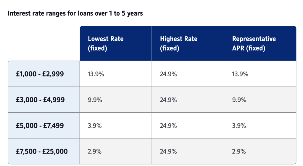
A table must have a clear title which describes its purpose. Every table must have a unique title so people can tell the difference between tables with similar content.
The title can either be a heading tag (e.g. <h2>) or a table caption element (e.g.<caption>). Using a heading tag gives content designers more flexibility over the content hierarchy than a caption. If using a heading tag (as NEL does), reference it with an ‘aria-labelledby’ attribute on the <table> tag. This attribute enables a screen reader to read the title when it discovers a table on a page, similar to using the table’s caption element.
<table>

<caption>Interest Rates</caption>

...

</table>
Or
<h2 id=”table-1”>Interest Rates</h2>

<table aria-labelledby=”table-1”>

...

</table>
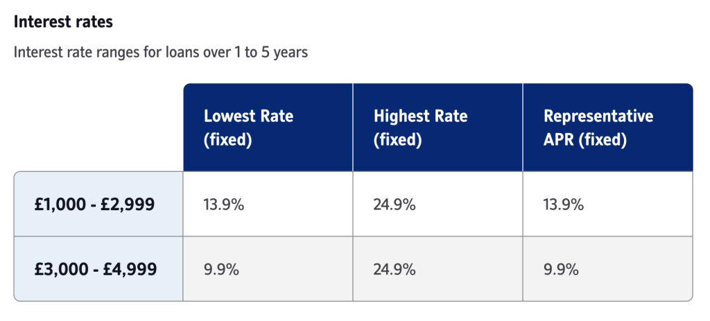
Add a summary (optional)
When using a heading tag to provide a table title, add a summary paragraph below the table title if more contextual information about the table’s purpose is required.
<h2 id=”table-1”>Interest Rates</h2>

<p>Interest rate ranges for loans over 1 to 5 years</p>

<table aria-labelledby=”table-1”>

...

</table>
Provide column headers
Always provide column headers (e.g. <th>) for each column in a table. Column headers should be visually prominent and clearly and concisely describe the information in each column. People using screen readers use column headers to understand the context for the data in a table cell. Keeping column headers short and relevant can help these users find and compare content more easily.
<table aria-labelledby=”table-1”>

<tr>

<th>Lowest Rate (fixed)</th>

<th>Highest Rate (fixed)</th>

<th>Representative APR (fixed)</th>

</tr>

...

</table>
When needed, provide row headers
Depending on the content, complex tables may often need both column and row headers to help people understand the data more easily. Comparison tables use row headers (e.g. <th>) where there are sub-categories of content to help users efficiently compare and weigh up the options on display. Row headers like column headers should be visually distinct to enable people to understand the table’s structure and relationships in the content.
For tables with column and row headers, the relationship between the table header and the cells must be explicitly referenced in the code to improve the experience for people using screen readers. Ensure the ‘scope’ attribute with either a ‘col’ or ‘row’ value associates the header with the relevant column or row.
<table aria-labelledby=”table-1”>

<tr>

<td></td>

<th scope=”col”>Lowest Rate (fixed)</th>

<th scope=”col”>Highest Rate (fixed)</th>

<th scope=”col”>Representative APR (fixed)</th>

</tr>

<tr>

<th scope=”row”>£1000 - £2,999</th>

<td>13.9%</td>

<td>24.9%</td>

<td>13.9%</td>

</tr>

...

</table>
Use zebra striping
Use zebra striping to aid readability by helping users scan and compare information in the table. Use different colours such as white and grey to help people differentiate between rows in a table.
Make sure tables are responsive
Small, simple tables with few columns will usually respond automatically to fit on narrower screens. However, larger complex tables may introduce horizontal scrolling in the browser, potentially hiding part of the table’s content. When this happens, it can make the table difficult to read and understand.
To help people understand that more content is available off-screen, provide instructions above the table to explain that more content is available by scrolling or swiping.
Alternatively, altering the design of a table to display differently on narrower screens may help improve readability and understanding. Be careful when using this approach as a sudden and significant change in layout may make it more difficult for people to understand the content, especially when a table contains side-by-side comparison information.
Enable keyboard interaction
If the table content overflows or becomes too large to display everything on the screen, ensure that keyboard users can access the hidden content. In code, when the table overflows, use a `tabindex=” 0″` attribute on a container around the table. This attribute will make the container focusable and allow keyboard users to use arrow keys to scroll the hidden content into view.
<div tabindex=”0”>

<table aria-labelledby=”table-1”>

...

</table>

</div>
To make the container accessible to everyone, it must have a role and a clear label. Ensure there is a ‘role’ attribute with a ‘generic’ value on the container and that the container has a name. The name can be added with an ‘aria-label’ or associated with the table caption or table title using the ‘aria-labelledby’ attribute. This additional information helps people using screen readers understand its purpose.
<h2 id=”table-1”>Interest Rates</h2>

<p>Interest rate ranges for loans over 1 to 5 years</p>

<div tabindex=”0” aria-labelledby=”table-1”>

<table aria-labelledby=”table-1”>

...

</table>
Avoid merged cells
Avoid merged cells (which span multiple rows or columns) where possible, as they can be challenging to navigate with a screen reader. It’s best to replicate the data in various cells rather than trying to merge cells with the same content.
Improve the readability of printed tables
Sometimes people may want to print tables containing reference or comparison information. Use additional markup in the table (e.g. <thead> and <tfoot>) to repeat the header and footer of a table on each page in the printed document, making the printed copy easier to read.
<table aria-labelledby=”table-1”>

<thead>

<tr>

<td></td>

<th scope=”col”>Lowest Rate (fixed)</th>

<th scope=”col”>Highest Rate (fixed)</th>

<th scope=”col”>Representative APR (fixed)</th>

</tr>

</thead>

<tbody>

<tr>

<th scope=”row”>£1000 - £2,999</th>

<td>13.9%</td>

<td>24.9%</td>

<td>13.9%</td>

</tr>

...

</tbody>

</table>
How do screen readers interact with tables?
A screen reader will read the content in a table from left to right, top to bottom.
Some screen readers provide keystrokes that allow users to interact more easily with the content. For example, screen readers allow users to navigate to each data table and then navigate vertically and horizontally through the table, providing contextual headers as they go. They can also, at any time, investigate the current cell where they hear the column heading, row heading, column number, row number, and value of the cell.
Things to check
Have you?
- Used a table for displaying tabular data
- Made sure the table has a unique title which is clear and concise
- Used column headers (e.g. <th>) and row headers (where necessary) to describe the column content
- Made sure the table can be accessed using a keyboard alone
Thank you for your feedback