

Introduction
Display orientation refers to whether a device is in landscape or portrait mode. Websites, apps, documents and emails must adjust to support landscape and portrait display orientations, allowing users to choose the best mode for their needs.

David is physically disabled and uses a power wheelchair to move around. His iPad is fixed to the arm of his wheelchair in landscape orientation so he can watch films and TV shows on Netflix. David often has difficulty viewing digital content exactly as he would like because many websites and apps lock their display to portrait orientation.
Why is it important?
Some websites and apps automatically restrict their display to a particular orientation, often for aesthetic reasons. While this is inconvenient for some people, it can prevent others from using the digital service. Developers often assume that users can rotate their devices to match the set orientation when this might not always be possible.
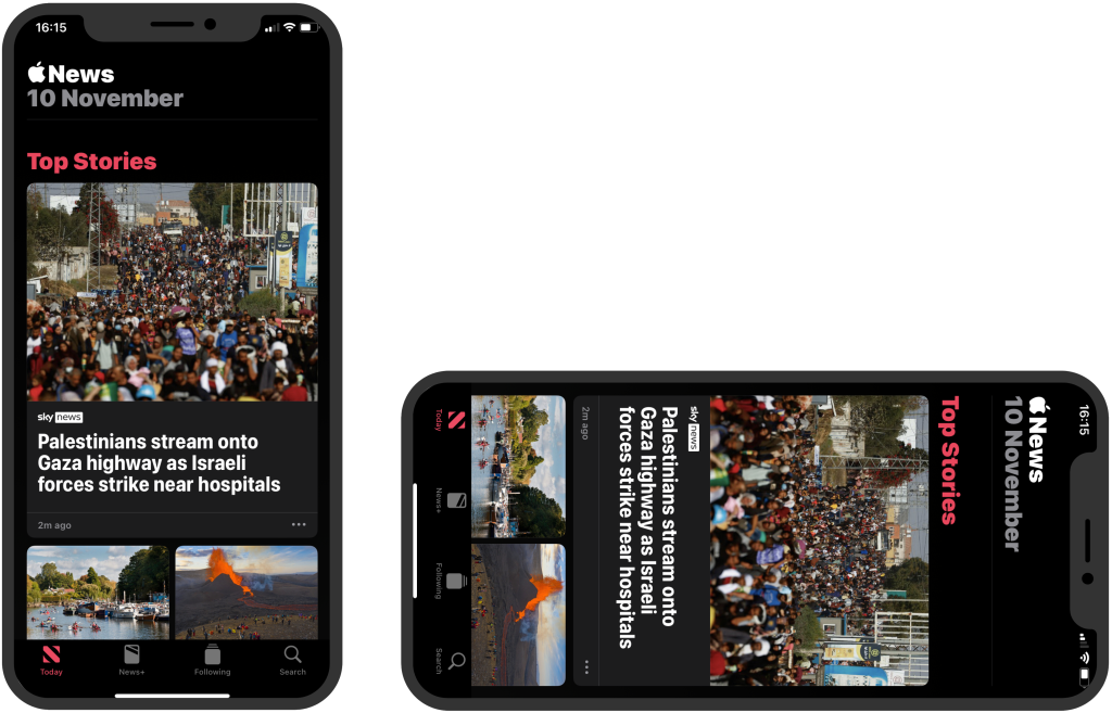
Figure 1: The Apple News app displays only in portrait orientation. It doesn’t adapt to display in landscape mode.
Many people want to view content in their preferred display orientation. However, many users with physical disabilities cannot easily change their device’s orientation. Some have their devices fixed to a particular orientation to make interacting with digital content more comfortable.
Content that adapts its orientation benefits people with low vision. Many low-vision users increase text size or zoom in to read content more easily. For these users, using a landscape display orientation accommodates larger text sizes and longer lines, which helps to improve readability.
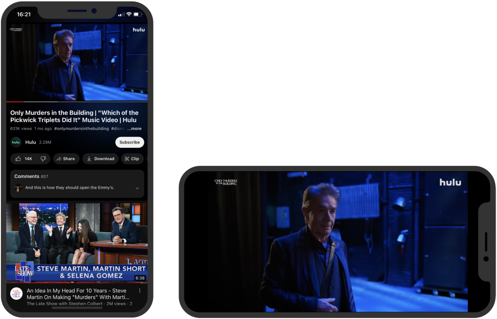
Figure 2: The YouTube app adapts to both portrait and landscape display modes. In landscape orientation, it enhances the viewing experience by making the video full-screen.
Exceptions
In certain situations, restricting content to a particular display orientation is essential for people to understand the content clearly. For example, a banking app’s cheque deposit feature is an exception to this guideline. As a cheque is twice as wide as it is tall, this functionality requires the device to be in landscape mode to easily and accurately capture an image of a cheque.
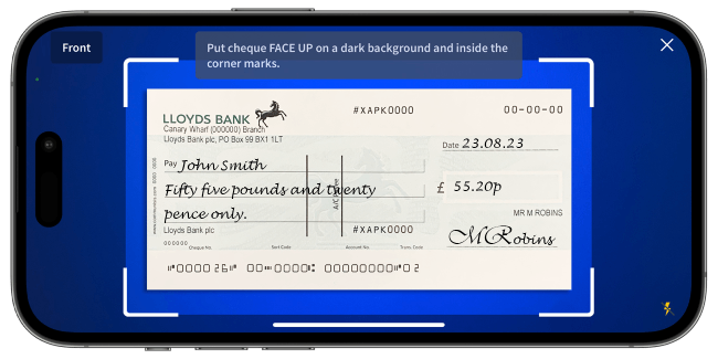
Figure 3: The Halifax banking app restricts the orientation to landscape for depositing a cheque.
How do we meet this guideline?
Ensure that websites and apps respond to the device’s orientation and adapt their layout appropriately. Using responsive design techniques for web-based content will help you meet this guideline. Force a specific orientation only when it is necessary for a particular feature.
Things to check
- First, check the device settings to ensure the display orientation lock is off.
- Check if the content adapts to portrait mode.
- Check if the content adapts to landscape mode.
- Check if the content functions correctly and is understandable when the display orientation changes.
- Check if there is access to controls and navigation.
- Check if it’s possible to navigate with a keyboard.
- Check if complex content, such as videos, graphs, tables, and forms, functions correctly in the particular display orientation
Thank you for your feedback